Insights
Insights is the long view of a habit you count. Where Statistics tells you which days you kept a task, Insights shows you how much you actually logged — as a chart you can scroll back through, day by day, week by week, or month by month. It also tells you, in plain English, whether you’ve been doing more or less lately.
Insights is for counter tasks only — the ones where you log a number, like pages read or glasses of water. A simple done-or-not task has no numbers to chart, so it doesn’t have an Insights screen.
To open it, go to Today, tap a counter task’s card to open its statistics, and then tap the Insights card — “Charts and trends over time”, just below the “This Week” strip. The little bar preview on the card is your last two weeks. Everything on the Insights screen is read-only.
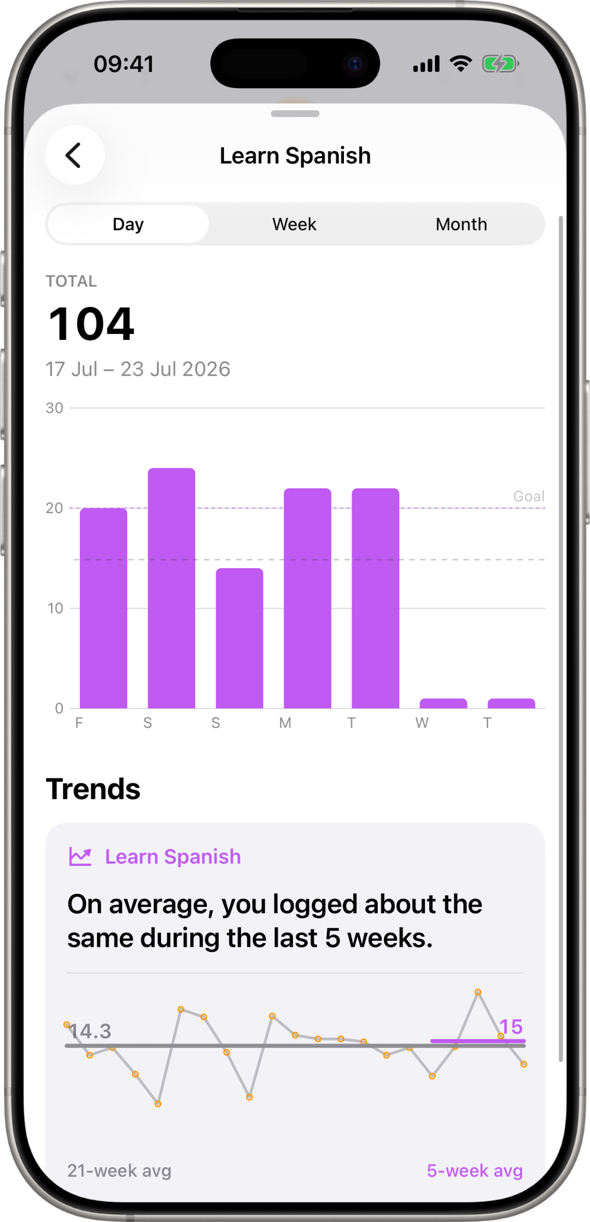
Day, week or month
At the top is a picker with three options that change what a single bar means:
- Day — one bar per day, with a week on screen at a time.
- Week — one bar per calendar week, with about a quarter on screen.
- Month — one bar per calendar month, with a year on screen.
Whichever you pick, you can swipe the chart sideways to travel back through your history. The picker only sets how much fits on screen at once — it never limits how far back you can look, and your history goes right back to the day the task started. The chart settles neatly on whole days, weeks or months rather than stopping mid-bar.
The header
Above the chart is the number that matters:
- Total — the sum of everything you logged in whatever is currently in focus. Normally that’s the whole visible window; while you’re touching a bar, it’s just that bar.
- The date range underneath tells you exactly what the total covers —
1 – 7 Jul 2026for a week of days,July 2026for a month, and so on. - Daily average — how much you logged on a typical day in that span. This appears on the Week and Month ranges only; on the Day range a bar is one day, so the total already is the daily figure.
Reading the chart
Bars are drawn in the task’s own color, and two dashed lines can appear across them:
- Avg — the average bar height across what you’re currently looking at. It’s a quick read on whether a given bar was a good day (or week, or month) by your own standards.
- Goal — your task’s daily target, so you can see at a glance which days you cleared it. This line shows on the Day range only, and only when the target is more than 1 — a target line only lines up with a bar when that bar represents a single day.
Touch and drag across the chart to inspect a single bar: the one under your finger stays bright, the rest dim, and the header switches to that bar’s total and date. Lift your finger and the header goes back to the whole window.
Trends
Below the chart, once you have enough history, is a Trends card that answers one question: am I doing more or less than usual?
It opens with the answer in a sentence — “On average, you logged more during the last 5 weeks.” (or less, or about the same). Underneath is a line of your weekly daily-averages with two flat lines drawn across it:
- The grey N-week avg — your longer-run baseline, up to 21 weeks of history. The number in the label is the real span used, so if the task is younger than that it says so.
- The colored 5-week avg — the same figure for just your last five weeks.
The gap between those two lines is the trend. Small wobbles are ignored on purpose: a change of less than about 5% is reported as “about the same” rather than dressed up as a trend.
The Trends card only appears once a task has roughly 10 weeks of history. Below that, the recent five weeks overlap the baseline so heavily that any verdict would be noise, so Kyro says nothing rather than something misleading. Keep logging and the card turns up on its own.
When there’s nothing to show
If you haven’t logged anything yet for the task, the screen shows “No Data Yet” with a nudge to log a count. The chart appears as soon as you record your first number.